Just picked up a copy of '20th century type' by Lewis Blackwell. Look forward to browsing the pages and hope to gain some insight.
19 December 2008
London Postcards
Below are a series of postcards for a brief based on London.


They were fairly successful but possibly too stylized, although I do like the systematic links. I am beginning to realise that there are lots of mistakes to be made, and there is a lot to learn from said mistakes.
Labels: graphic design
17 December 2008
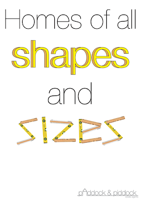
Estate Agent project

This is my outcome for the latest graphic design brief. We were given a starting point of a fictional estate agents, Paddock & Piddock. As i've been experimenting with illustrative styles of type over the past few weeks I thought it be best to apply this to the task. I also have created an A5 flyer that folds open to reveal a variation of 'pop up' scenery.
Labels: graphic design, typography
5 December 2008
We three papers

As in the photo from the last post I am most impressed by the shadows. Found it tricky to get a a good composition with it on its own so just put some variations together.
Labels: typography
4 December 2008
PaperPaper

I've been meaning to get this idea down for a while. I particularly like the shadows and may utilise them in future.
Labels: typography
Cybernetic organisms

This is a digitalised version of 'Robot type'. I'm fairly pleased with it so far but going to come back to it a bit later to tighten it up a bit. It took a while and was quite tedious but totally worth it as it can now be recycled and manipulated for future fun.
Labels: illustration, typography


